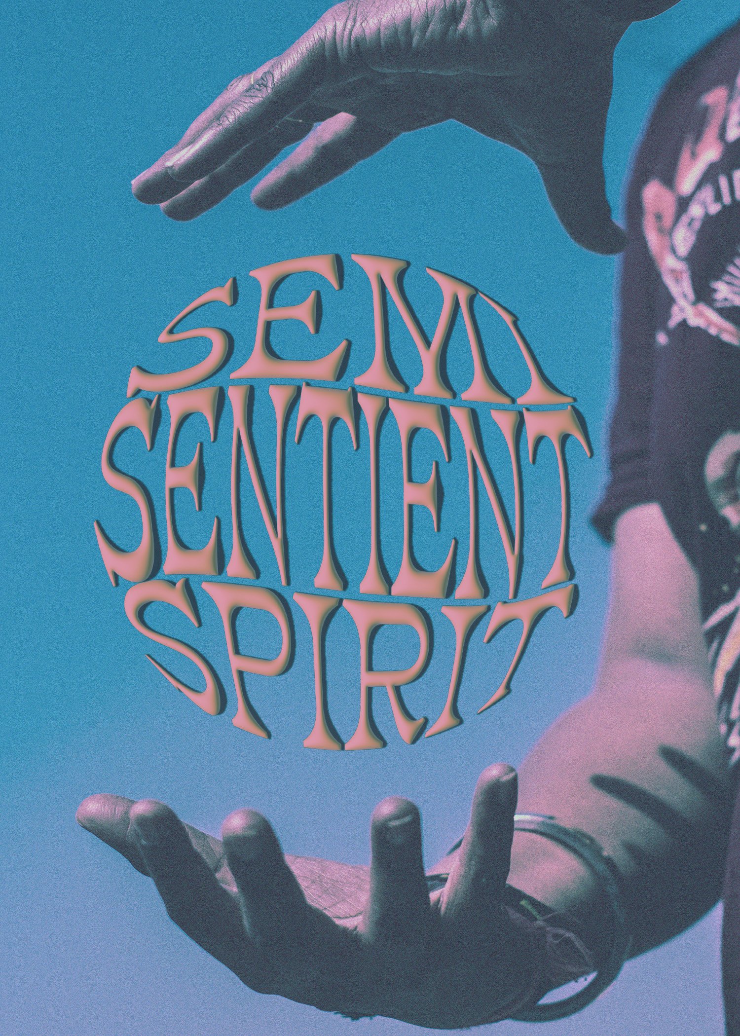
I’ve been delaying starting the third part of the online graphic design course for no real reason other then I have been distracted with the upcoming Vermont residency and applying to some jobs and various other little things, but lately I have been trying to make some interesting (to me) posters in Photoshop. Some of the images below are duplicates with altered text, where I couldn’t make up my mind with what paired better, but figured why not have two versions if I was happy with both?
Images have all come from Pixels.com - amazing source - with text from my own notes and cool free texture overlays that I have found from Instagram/online. I am unsure what these are doing, but making that has been very enjoyable so far.


